Sometime back in the early aughts (or “The Naughties” as I liked to call them then), I was having a conversation with a friend, and the idea of webcomics came up, and I admitted that I had a vague hankering to try my hand at one. We brainstormed ideas, as one does, and I came up with this concept of Johnny Dangerpants. The entire gag, or as far as I got, was that he’d get into trouble while wearing bright red pants. The comic idea never took off, but I liked the name Dangerpants enough that I grabbed the domain name, surprised to find it available.
I needed to have some content, thus the page you see now at dangerpants.com, with its prominent red-pants logo.
Fast-forward about ten years, and I decided I wanted to form a photography business. The obvious choices were Ian Johnston Photography or Dangerpants Photography. There are about a zillion Firstname Lastname Photography businesses, and while it’s an obvious brand, I liked the idea of using this more distinctive name I’d come up with before. Besides, I already had the domain. Thus, Dangerpants Photography.

The Original Logo
Obviously, a business needs a logo (particularly an image-focused business like a photographer). I already had a logo for Dangerpants (which had already been adapted for Dangerpants Labs), so I rolled with that. I’d already re-drawn the logo once, since the original version was done up rather hastily and before I had any idea what I was doing.

The New (redrawn) Logo
The new one was better, much higher quality execution, but still pretty fiddly when you shrink it down and add it as a watermark to photos. I wanted something cleaner, and different. Maybe less web-comic looking. (Obviously I would have been a hit with Johnny Dangerpants.)
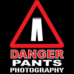
Then one day I was on my way home, and idly pondering on this question when I realized I could call on the existing danger vocabulary for my new design. Everyone recognizes those red-triangle-around-icon-object images as a sign showing something that was dangerous. Why not go with something like that? In a surprisingly short time, I had my new logo.
I really like how it turned out, although the first time I tried watermarking a photo with it, I was shocked at how different it looked. In time, it has grown on me. I’m very pleased with the simplicity and recognizability of it.
Now you know more than you ever wanted to know about the thought process behind a small businessman’s branding decisions.

